When it comes to the trending pantone of color, Veri Peri, there truly are no limits. While every event is unique unto itself, and often times an event's colors are dictated by an organization’s branding materials or company logo, in an effort to stay relevant its always wise to somehow incorporate what's trending in color. Weddings tend to be trendier, but still are usually all about the bride or groom’s favorite color or personal sense of taste. Then there is the client who gives you creative freedom with one simple direction, try your hand using this year's color trends.
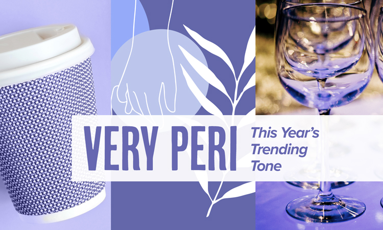
Pantone, the global color authority and provider of professional color language standards and digital solutions for the design community, has selected "Veri Peri" for color of the year 2022. Described by Pantone as 'a dynamic periwinkle blue hue with a vivifying violet-red undertone that blends the faithfulness and constancy of blue with the energy and excitement of red' – it's a colour promising to bring joy as the 'happiest and warmest of all the blue hues'.
The question is, how can I pair with purple?
Very Peri is great for providing an eye-catching pop of colour – table linen and decor rentals, accent furniture rentals and floral design all provide opportunities to incorporate this cool blue and red color. Or, if you only want a touch of Very Peri in your event, pick out blue or lilac glassware accessories and group them together for impact, then add a few stems of lavender. For an even easier hit of Very Peri, look for cushions and throws in purple hues to work the colour into your accent furniture rentals.
Together let these two colors add a solid yet optimistic union of strength and positivity to your next meeting or event this year!
There are plenty of colours you can pair with the dynamic Very Peri shade. From deep blues to more muted whites and greys, here are seven colours to pair with this new red-violet-infused blue hue:
-
White: Try pairing with white for a fresh, clean New Year makeover. Keep the white dominant and include accents of Very Peri to avoid the scheme looking too saccharine. For a more modern take on this colour, use stripes, geometric or colour block paint effects. Or, you can embrace the romantic, whimsical potential of Very Peri by opting for floral, soft prints for fabrics and accessories, perfect for a spring or summer event!
-
Pink: Paring pinks with Very Peri creates a cohesive interior finish because they are analogous colours, so sit next to each other on the colour wheel. To create a statement with Very Peri, match it with a lighter tint or shade of pink which will help make it stand out at your event. For a bold impact, pair Very Peri with a bright, bold pink shade. If you choose this route, its best to compliment these shades with more neutral colours to ensure that they "pop", and overall, create a harmonious colour pairing. If you prefer to create a more subtle statement, try adding Very Peri and pinks through smaller decorative items, such as table vases, napkins or floral accents.
-
Beige: Try this for a more balanced look. The calmness of a blue, with a touch of red that brings warmth' can bring a sense of positivity to a room. Veri Peri also pairs well with both grey and neutrals, as well as warm tones too. These neutrals are calming and balancing shades that work well together with Very Peri bringing freshness and life.
-
Gray: Versatile grey goes with just about any colour, and it'll pair wonderfully with purple/blue hues and make your event current. Alongside another accent color such as yellow, will really make your event pop. Adding floral arrangements will provide some green to help create balance and texture with this color choice.
-
Orange and Yellow: Pairing these hues with Veri Peri can make these colors appear more vivid, as they are complementary and sit opposite one another on the colour wheel. This pairing creates a bold statement for an event and can be used with your table linens, decor and furniture cushions paired with neutral coloured furniture for a contrast.
-
Green: We see earthy tones every single day and these colours paired with Veri Peri can provide a balanced colour palette for your gathering. Earthy tones, greens and browns are found within nature, so naturally, create a harmonious pairing, Using natural greens will allow Veri Peri to stand alone and be the focal point of your event.